At the presentation organized by the Almaty City Development Center in conjunction with the Almaty City Tourism and External Relations Authority, held today, August 23, the chairman of the board of the Almaty City Development Center, Zhanna Tulegenova, presented the city's tourism brand.
The guests of the presentation were the media and travel agencies of the city.
The main goals of creating a tourist brand are to increase the recognition of the city, tourist attraction, attract investment, as well as the formation of a single style of the city.
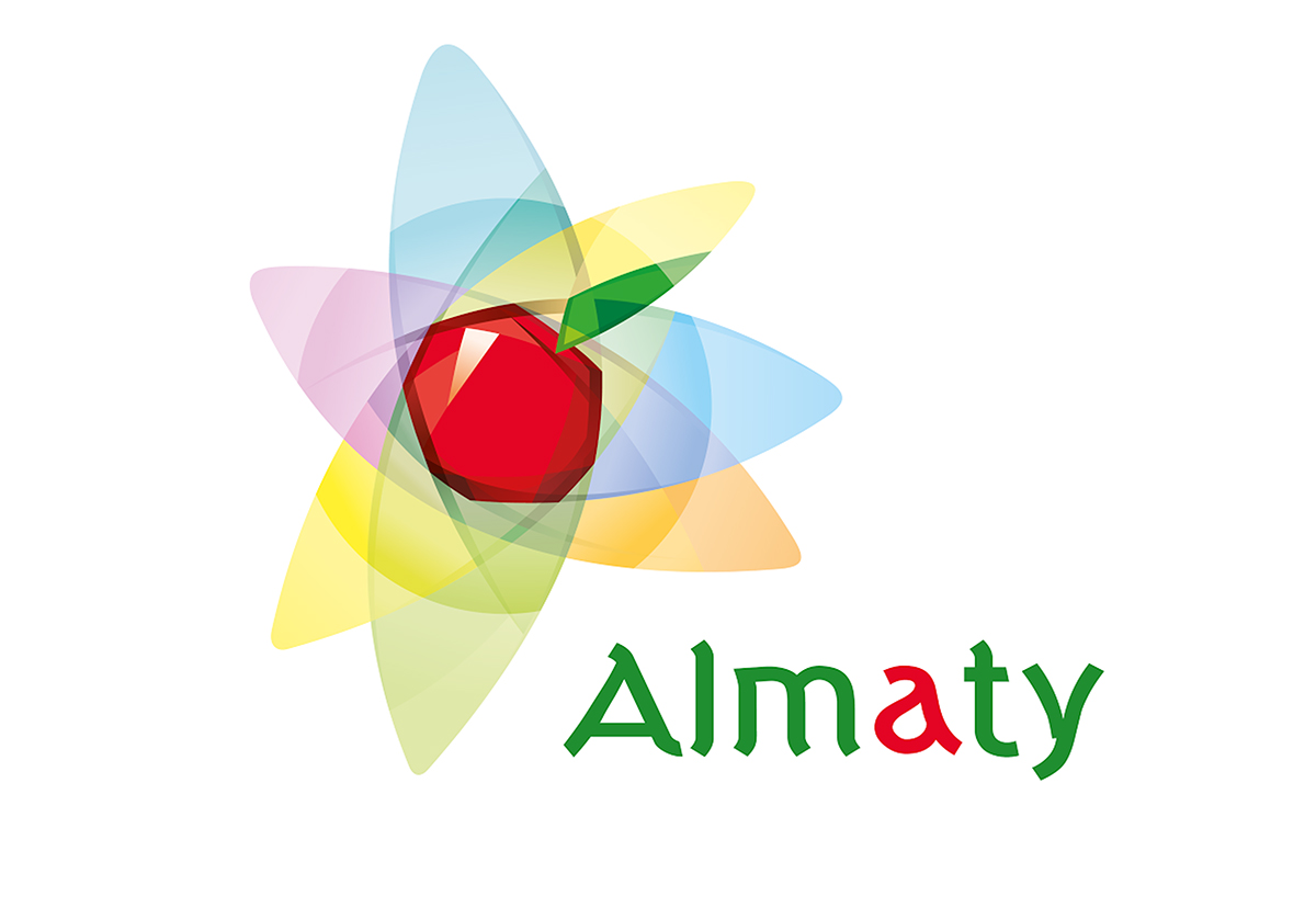
The city's tourist brand is made with modern trends in mind and with the preservation of cultural and historical traditions, reminding the structure of the atom - an indivisible particle.
The apple in the center is the nucleus, and the seven circles around it are the 7 orbits of energy embedded in the nucleus. In Kazakh culture, the number seven has a sacred meaning, symbolizing the respect for the past - the traditions of the people and embodies the aspiration to a bright future. Kazakhs not only honor the «zhety ata» (seven fathers), but also list seven generations after themselves. This speaks to people's awareness of being part of something more, of their concern for future generations.
The color code of the logo is based on Kazakh ornamentation. Associatively, it is the colors of the sky, the flag of Kazakhstan, the sun, freedom, vitality and energy, harmony with nature, inspiration and purity of the creative way.
The inscription below, filled with latin letters, recognizable all over the world, symbolizes the openness and hospitality of the metropolis to visitors and the city's focus on tourism development.
The inscription is made using green and red flowers. Green has symbolic value, both at the level of cultural characteristics of the people and at the level of global perception. Traditionally, green is a symbol of youth and spring, an expression of growth and development. In the world perception it is identified with issues of ecology and sustainable development. Also in the inscription «Almaty» one letter is executed in red, which is a symbol of life and creative impulse.
Earlier, in January 2016, the Department of Architecture and Urban Development announced a competition for the creation of the city's brand book, which ended on May 6 of the same year. The aim of the competition was to identify the best concept for the creation of the city's brand book, taking into account urban traditions, cultural heritage and modern trends.
An expert commission of 14 specialists, including historians, artists, designers, was formed to select the work. The members of the expert commission selected 25 of the best works from the 109 applications. These work were put on the Internet for voting. The voting, which was attended by over 3,000 people, identified eight of the most interesting work. The concept developed by Tigren Tuniants, which was the basis for developing a tourist brand of the city, was the best work. On the basis of this presented brand, a brand-book will be developed, which will be born in December this year.


